
The three parts of colour
| Component | What to look for |
|---|---|
| Hue | Green may lean slightly yellow, mint, grey, or olive. Preference is personal, but obvious brownness usually reduces appeal. |
| Tone | Most prasiolite is light. Extremely pale stones can look nearly colourless; overly dark material may lose brightness. |
| Saturation | Enough colour should remain visible in normal indoor light, without relying on highly edited photographs. |
Why lighting changes the appearance
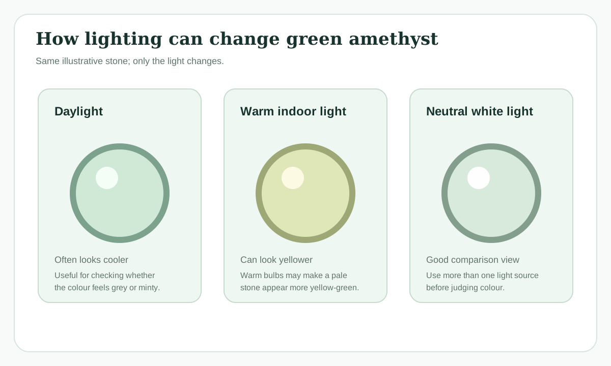
Daylight, warm household bulbs, jewellery-store spotlights, and phone-camera processing can make the same stone look different. View a prospective purchase in at least two lighting conditions and ask for neutral-background photos.
A simple colour range
These are descriptive ranges, not grading standards. Real stones vary, and your screen can change how colour appears.
How cut affects perceived colour
A shallow or poorly proportioned cut may create a large transparent “window” through the centre. A thoughtful cut returns more light and can make subtle colour appear more lively. Larger stones may show more colour simply because light travels through more material.
A practical colour test
- View the stone face-up and from the side.
- Check it in daylight and ordinary indoor light.
- Look for even colour rather than a pale centre with dark edges.
- Compare photos against a white or grey background.
- Do not use emerald as the colour benchmark.
What colour is “best”?
There is no single official best shade. The strongest combination is usually visible, even green colour plus brightness and an attractive cut. Personal preference matters more than marketing labels such as “mint,” “sage,” or “seafoam.”
Judge colour in three views
Online photographs can make subtle green quartz look dramatically different. Before deciding that one colour is “better,” compare it in more than one view.
- Neutral daylight: see the basic hue and tone without a strongly warm or cool cast.
- Normal indoor light: check how the stone looks where it will actually be worn.
- Face-up and tilted: tilt the stone slowly to separate body colour from dark extinction or a pale window caused by cut.
| What changes | What you may notice |
|---|---|
| Warmer lighting | Yellow-green notes can become more obvious. |
| Cooler lighting | The stone may appear greyer or slightly more blue-green. |
| Dark background | Pale colour can look more saturated than it will on skin or a light background. |
| Strong editing | Colour can look deeper or cleaner than the stone appears in ordinary use. |
Related reading
Quality and value · Price guide · Buying checklist
A practical colour reference
Prasiolite does not need to match one “correct” green. Use this as an appearance reference, not a laboratory grading scale.
| Appearance | What you may notice | Check before buying |
|---|---|---|
| Very pale green | Subtle, almost colourless in weak light. | Make sure you like how delicate the colour looks away from studio lighting. |
| Mint green | Cooler, fresh-looking green. | Check that the photograph is not heavily shifted toward blue/green. |
| Yellow-green / leek green | Warmer green with visible yellow. | Compare daylight and warm indoor light; warmth may become more obvious. |
| Grey-green | More muted and less saturated. | Decide whether you enjoy the subdued look rather than treating grey as automatically “bad.” |